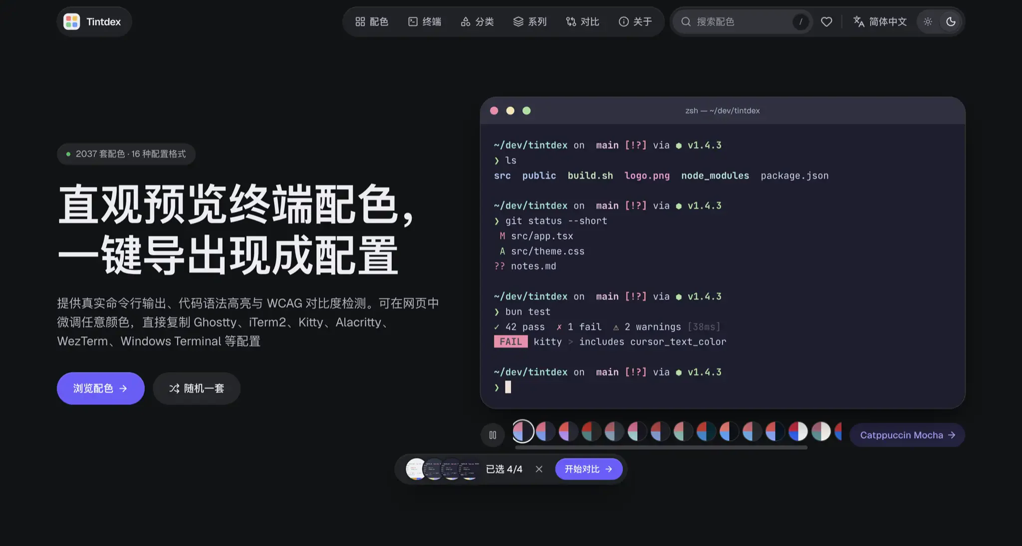
I built Tintdex (live at https://tintdex.afengim.com/ ), an open-source terminal color scheme explorer, live previewer, and interactive palette studio. It normalizes 2,037 community terminal themes into a unified palette model, lets you inspect them against realistic Shell, Git, process monitor, and multi-language syntax highlighting views, tweak individual slots or shift hues in perceptual OKLCH space, and export ready-to-paste configurations for 16 targets including Ghostty, iTerm2, Kitty, Alacritty, WezTerm, and Windows Terminal.
Why I Built My Own Terminal Color Scheme Workbench
Over the past few years of hopping between terminal emulators and code editors, I moved from iTerm2 to Alacritty, then to WezTerm, and recently settled on Ghostty as my daily driver. Every time I switched terminals or plugged in a new monitor, finding and migrating color schemes meant hitting the exact same friction points.
The first headache is format fragmentation. The exact same theme is a verbose XML .itermcolors plist in iTerm2, a TOML table in Alacritty, a Lua module in WezTerm, and plain key-value lines in Ghostty. Browsing theme repositories on GitHub usually gives you one or two static screenshots, leaving you to write one-off conversion scripts whenever you try a new terminal.
The bigger frustration is the gap between curated screenshots and real terminal workloads. Plenty of themes look gorgeous in a hand-picked neofetch screenshot, only to fall apart the moment you run git diff, htop, or bun test locally—either color0 (black) and color8 (bright black) comments vanish into the background, or saturated red errors and yellow warnings sear your retinas after half an hour in a dark room. Fixing just one or two illegible ANSI slots meant opening a local config file, guessing hex values, saving, reloading the terminal, and repeating the loop a dozen times.
What I actually wanted was straightforward: a browser workbench where I could test themes against the CLI outputs I stare at every day, see exact contrast numbers for every ANSI slot, nudge whichever color felt off, and immediately copy the finished config for my terminal. Since existing galleries always stopped at static previews, I built Tintdex (https://tintdex.afengim.com/ ).
2,037 Color Schemes Indexed Across 11 Visual Styles
To cover both battle-tested classics and hidden community gems, Tintdex aggregates and deduplicates 2,037 color schemes from six open-source collections: iTerm2 Color Schemes, Gogh, Tinted Theming (Base16 & Base24), Alacritty Theme, Warp Themes, and Kitty Themes.
Live-Rendered Popular Scheme Cards
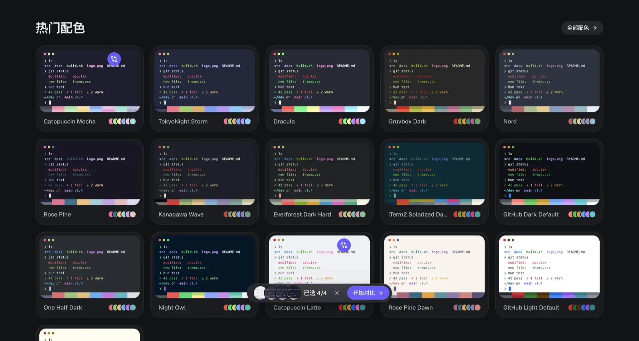
Scrolling alphabetically through more than two thousand themes is a recipe for fatigue. On the homepage and the main directory (https://tintdex.afengim.com/schemes ), every card is rendered live using the scheme's actual palette—complete with directory listings, git status diffs, and test runner output—so you can judge warmth, saturation, and legibility at a glance.
11 Visual Style Categories by Luminance, Temperature, and Chroma
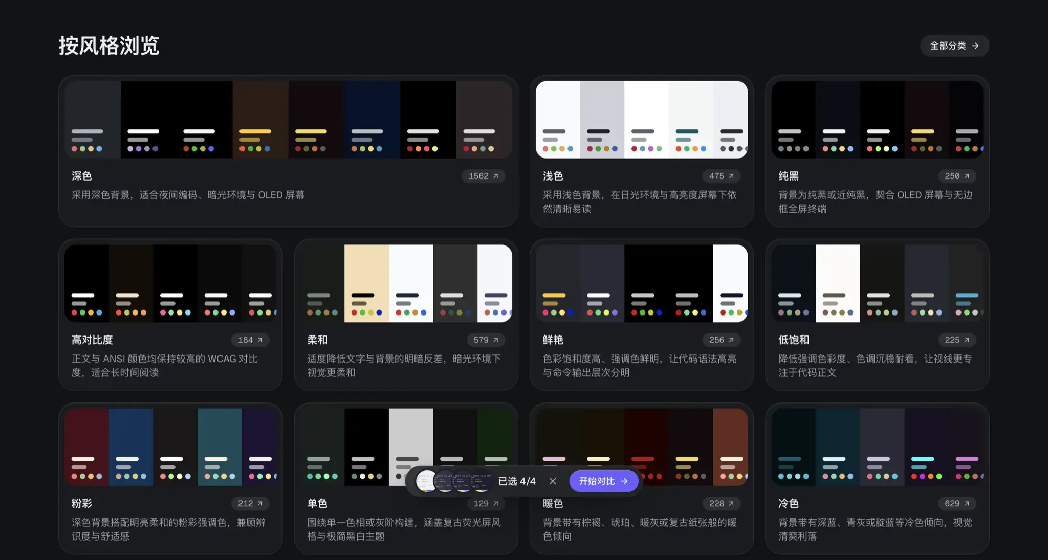
Beyond popularity sorting, I organized the entire catalog into 11 visual style categories (https://tintdex.afengim.com/categories ) based on background luminance, chroma, and color temperature:
- Dark (1,562 schemes) & Light (475 schemes): Covering both low-light night coding and bright daylight or high-ambient office setups.
- True Black OLED (250 schemes): Pure black or near-black backgrounds tailored for MacBook Pro XDR displays and OLED monitors where borderless full-screen terminals blend into the bezel.
- High Contrast (184 schemes) & Soft (579 schemes): High-contrast palettes enforce strict WCAG readability across all ANSI slots, while soft palettes temper luminance delta to reduce eye strain during long sessions.
- Pastel (212), Muted (225), Vibrant (256), Warm (228), Cool (629), and Monochrome (129): Whether you want retro amber CRT phosphor, Nordic slate blue, or gentle pastel accents, you can filter directly by visual mood.
Real CLI Workload Previews and Per-Slot WCAG 2 Contrast Audits
Opening any scheme detail page drops you into an interactive preview workbench with three primary view modes at the top: Terminal, Code, and Contrast.
Eight Realistic CLI Scenarios and an Interactive Shell Sandbox
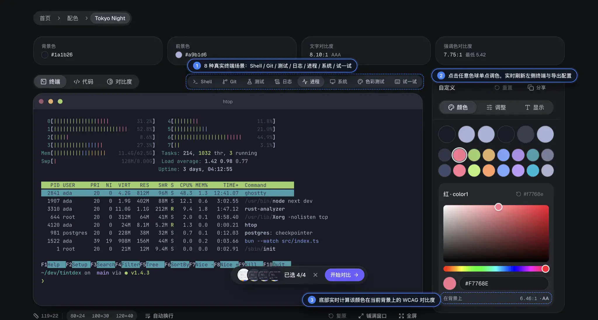
Under the Terminal view, you can switch between 8 realistic command-line scenarios to stress-test how a palette handles dense output:
- Shell: Everyday
ls -lafile permissions, directory coloring, andgit statusbranch prompts. - Git: Authentic
git diffadditions/deletions and commit graph logs. - Test: Simulated
bun testruns with pass (green), fail (red), warning badges, and timing summaries. - Logs: Structured server logs with timestamps and
INFO/WARN/ERRORseverity badges. - Process: A full
htop-style multi-core CPU meter, memory bar, and highlighted process table. - System:
neofetch/fastfetchsystem info alongside an ANSI color block matrix. - Color Test: The classic 16-color foreground-on-background matrix table.
- Try It: An interactive terminal sandbox right in the browser where you can type commands like
help,ls, orgit statusto test the theme live.
Per-Slot WCAG 2 Contrast Ratio Audit Matrix
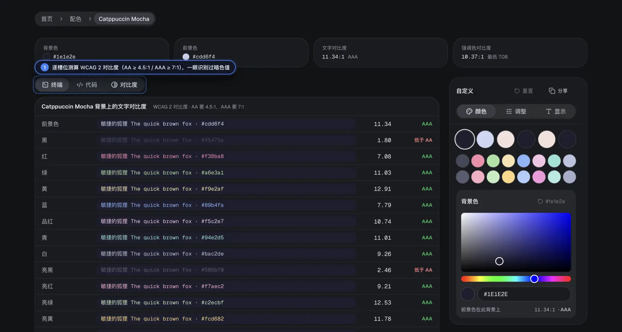
Subtle legibility traps that hide in a basic Shell prompt become obvious the moment you switch to the Contrast view. Tintdex computes the exact WCAG 2 contrast ratio for the foreground text and all 16 ANSI colors (color0 through color15) against the active background, badging each slot as AAA (≥ 7.0:1), AA (≥ 4.5:1), or below threshold.
Take Catppuccin Mocha as an example: its primary text contrast is a crisp 11.34:1 (AAA), and its red, green, yellow, and blue accents all score above 7.08:1. Yet the contrast matrix immediately reveals that Black · color0 (#45475a) and Bright Black · color8 (#585b70) sit at 1.80:1 and 2.46:1 against the #1e1e2e background (both flagged in red as below AA). If a CLI tool or shell autosuggestion binds muted hints to color8, you can spot the issue before exporting and brighten that single slot on the spot.
Interactive Slot Editing and Perceptual OKLCH Color Tuning
When a single ANSI slot is too dim—or when you love a theme's structure but wish the background were slightly darker—you don't need to edit config files blind. The Customize panel on the right lets you modify the palette live in the browser.
Per-Slot Picking Across All 22 Color Slots with Live Contrast Feedback
Under the Colors tab, background, foreground, cursor, cursor text, selection, selection text, and color0–color15 are laid out as 22 circular swatches. Clicking any swatch (such as Red · color1 in Tokyo Night) opens a 2D saturation/brightness picker and hex input.
Every frame you drag the picker updates the terminal preview, the code syntax view, and the live WCAG contrast readout at the bottom of the picker—and syncs directly into the 16 export configs below. If an experiment goes too far, a single click on the per-slot reset button restores the original hex value.
Perceptual OKLCH Hue Rotation and Multi-Language Code Highlighting
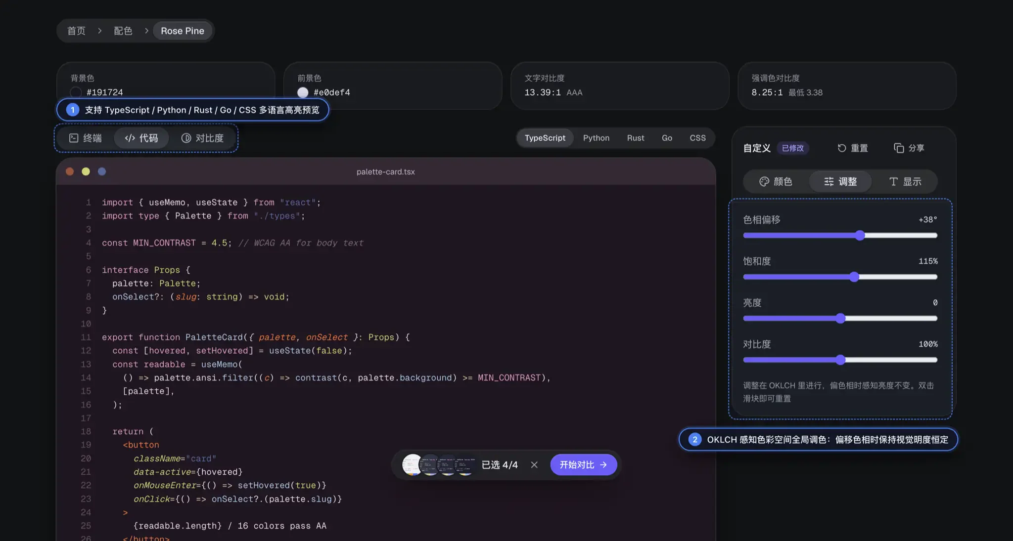
Sometimes you love a scheme's contrast hierarchy and cadence, but want to shift its overall mood—say, nudging the muted plum tones of Rosé Pine toward cool teal or warm amber.
Rotating hue globally in traditional HSL space almost always breaks a terminal theme: yellows suddenly blow out while blues collapse into muddy darkness because HSL ignores human perceptual luminance. To solve this, Tintdex performs all global adjustments in the OKLCH perceptual color space:
- Hue Shift (
-180°to+180°): Rotating the palette's hue preserves the perceived lightness of every single slot, keeping syntax hierarchy and readability intact across the entire spectrum. - Saturation, Lightness, and Contrast Sliders: Dial back overly neon themes into calm, low-chroma palettes or lift shadow tones globally. Double-clicking any slider resets it to default.
- Display Environment Simulation: Under the Display tab, you can switch monospace fonts (such as
JetBrains Mono), tweak font size and line height, toggle bold-as-bright and cursor blinking, and test layout density across80×24,100×30, and120×40terminal geometries.
Once you dial in a custom variation, clicking Share encodes your entire modified palette into a self-contained URL you can bookmark or send to teammates.
Six Standout Palettes and the Multi-Theme Comparison Workbench
If you are not sure where to start exploring, try a few time-tested community favorites first and then line them up in the comparison workbench.
Six Battle-Tested Palettes for Long Coding Sessions
These six schemes span pastel dark, cool indigo, muted pine, retro warm earth, ukiyo-e sumi ink, and daylight paper styles, with direct links to their interactive workbenches:
| Scheme | Visual Character | Background / Foreground | Body Contrast | Live Preview & Customizer |
|---|---|---|---|---|
| Catppuccin Mocha | Soothing pastel dark benchmark with rich, non-fatiguing accents | #1e1e2e / #cdd6f4 |
11.34:1 (AAA) |
https://tintdex.afengim.com/schemes/catppuccin-mocha |
| Tokyo Night | Deep indigo-slate cool dark built for late-night low-glare coding | #1a1b26 / #a9b1d6 |
8.10:1 (AAA) |
https://tintdex.afengim.com/schemes/tokyo-night |
| Rosé Pine | Muted pine-violet canvas paired with warm rose-gold highlights | #191724 / #e0def4 |
13.39:1 (AAA) |
https://tintdex.afengim.com/schemes/rose-pine |
| Gruvbox Dark | Iconic retro warm-earth palette with unmistakable syntax separation | #282828 / #ebdbb2 |
10.8:1 (AAA) |
https://tintdex.afengim.com/schemes/gruvbox-dark |
| Kanagawa Wave | Sumi-ink and wave-blue dark inspired by Hokusai ukiyo-e prints | #1f1f28 / #dcd7ba |
11.3:1 (AAA) |
https://tintdex.afengim.com/schemes/kanagawa-wave |
| Catppuccin Latte | High-legibility warm paper light theme ideal for bright daylight | #eff1f5 / #4c4f69 |
7.1:1 (AAA) |
https://tintdex.afengim.com/schemes/catppuccin-latte |
Side-by-Side Comparison of Up to Four Themes and Palette Mixing
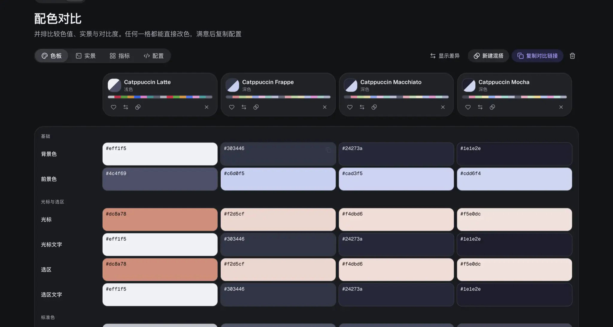
When you are torn between several close contenders, open the Side-by-Side Comparison Workbench (https://tintdex.afengim.com/compare ). It lets you line up up to 4 schemes simultaneously, complete with one-click presets for "Catppuccin Four Flavors", "Tokyo Night vs One Dark", "Dracula vs Nord", and "Gruvbox Dark & Light".
Inside the comparison view, you can inspect slot-by-slot hex deltas, live terminal renders, and contrast metrics side by side—or click New Mix to graft Catppuccin Mocha's pastel accents onto Tokyo Night's deep background and export the resulting hybrid.
One Palette, 16 Ready-to-Use Terminal and Developer Configs
Whether you stick with an untouched community classic or sculpt your own variant with per-slot and OKLCH controls, the Configuration Export section at the bottom of every page compiles 16 target formats in real time.
Instant Config Generation Across 11 Terminals, 2 Editors, and Web Tokens
The export panel groups targets into four practical categories, with one-click switching along the left sidebar:
- 11 Terminal Emulators:
Ghostty,iTerm2,Kitty,Alacritty,WezTerm,Windows Terminal,Warp,foot,Rio,XFCE4 Terminal, andXresources(each tab includes the exact local config file path instructions, and you can also browse by terminal at https://tintdex.afengim.com/terminals ). - 2 Code Editor Integrated Terminals:
VS Code Terminal(workbench.colorCustomizationsJSON snippet) andZed Terminal. - 3 Web & Data Formats:
CSS Variables,Tailwind CSS v4(@themetokens), and structuredJSON.
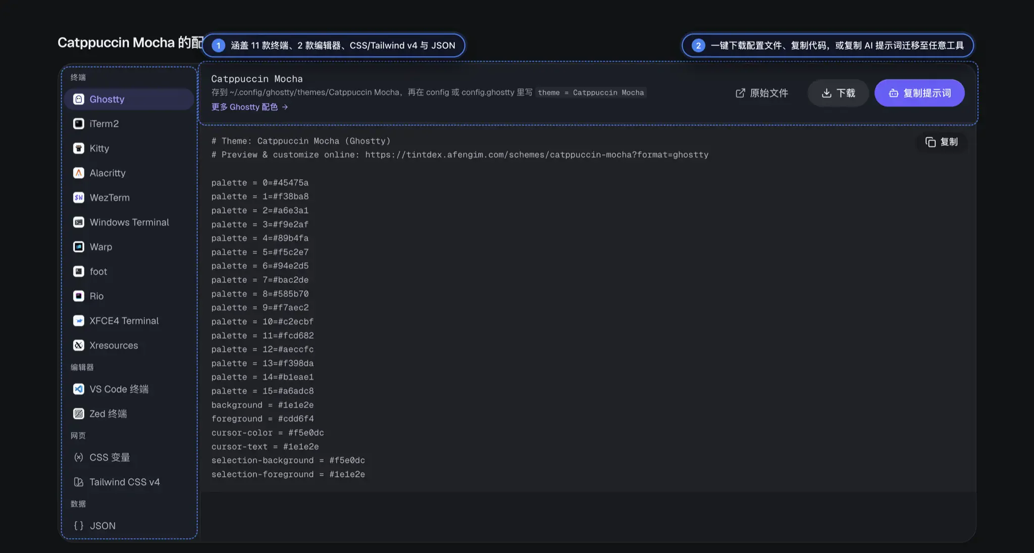
Alongside Download and Copy buttons, I also added a Copy Prompt button. If you use a niche terminal, a Tmux status bar, a Neovim colorscheme plugin, or a custom TUI app that isn't in the 16 built-in exporters, clicking "Copy Prompt" packages the exact 22-slot hex mapping into a clean prompt you can paste into any AI coding assistant to generate a tailored config in seconds.
Tintdex supports multiple languages including Simplified Chinese, Traditional Chinese, Japanese, and English. Head over to https://tintdex.afengim.com/ to take it for a spin and dial in your terminal setup.